Over the years I have been involved with a number of branding and re-branding projects for various organizations. Also, I have created unique logos for companies that capture the essence of their business model and mission statement.
Below are a few examples of my branding and logo work. Note: Logos were created by me in Adobe Illustrator and Photoshop.
Nick Iandolo

Yes, I created a logo for myself to brand me as a professional marketing communications writer (with a plethora of other professional skills). Now-a-days, as a professional individual (not just a corporate entity), one must have a unique identity, which includes a brand, that sets them apart from the rest of the competition. Professional writing is as much a competitive industry as any other.
If you look at this Portfolio Website overall, you will see that it is rife with the same branding styles and colors as the rest of my Nick Iandolo-centered marketing collateral.
The logo I chose to create was built around my initials [N, I] and my chosen moniker [Nick Iandolo]. Since I really like the colors red and black I, chose to incorporate them into my logo and brand.
The branding concept (as evidenced by this entire portfolio website) encompasses the eight core services that I provide for my clients and companies—with the predominant ones listed first: Marketing Communications, Copywriting, Public Relations, Journalism, Branding & Logos, Custom Graphics, Videos, and Websites.
The branding styles can be best seen on my current Candidate Profile One-Sheet that I send around to prospective employers. You can learn more about it on my Marketing Communications page (see the link above).
This logo and branding is also incorporated into a series of banners for my professional social media channels (Facebook, Twitter, LinkedIn, and Google+), see below:
Facebook, Twitter, and LinkedIn Banner
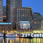
This banner (like this post’s featured image), displays my logo over a background of the Boston Harbor waterfront at night. Since I am a Boston-based professional writer (and was born in Boston), I have a special connection to this city; therefore, I use its imagery as part of my branding style. Also note that my tagline, 21st Century Digital Writing, is also part of the banner and my branding concept.
This one was created for the above social media channels based on their general image size guidelines. It translates fairly well for the various platforms that it appears on such as a computer webpage, mobile phone, or a tablet.

YouTube Banner
YouTube required a slight different version of the banner. The following image moves the logo and tagline to the center of the image (and makes it more prominent), which shows up better on YouTube webpage and mobile sites.

DVAC – Digital Visionary Access Corporation
The time that I spent at DVAC was an educational experience like none other. The volume of work that I produced there was second to none. Couple that with the wealth of new skills that I acquired allowed me to do just about anything that I could think of at that organization.
This included rebranding the entire organization with new logos, signage, and copy.
Part of that was changing the name from the old Dedham Visionary Access Corporation to the modern Digital Visionary Access Corporation. And with that, a logo to accompany the new moniker.
Below, the logo incorporates the DVAC initials along with the new company name. I wanted to keep the overall color scheme used for the Dedham Television logo but add some new colors in there as well. Also, note the ring and electron-like balls surrounding the words. That was to represent the modern digital age of the organization.

I created this logo in Adobe Illustrator.
I also created a new LinkedIn business page for DVAC. This page required a professional-looking header (below); therefore, I applied my Photoshop skills taking the logo and adding it to a collage of both the rolling green hills of Ireland and an aerial shot of New York City’s Times Square at night—the perfect balance of nature and beauty merging with our digital world.

Note: This is the original image of the banner/header. The LinkedIn business page itself was updated to a new format, and has changed the way it displays the image, which I do not have any control over.
Dedham Television (DTV)
And of course under DVAC was Dedham Television (and under that was the Media Engagement Center). Dedham Television had an old worn-out logo (from a slew of old worn out logos—see here for examples, plus read about the whole DVAC/DTV rebranding project). Just like with the updating of DVAC itself, the DTV logo needed to come into the 21st Century.
Here I worked with Susan Howland of Creativedge – Innovative Marketing Solutions to update the DTV logo. We chose to lose the old tube-style TV framing in favor of a modern digital HD flatscreen framing. The font was also stretched and cleaned up a bit to freshen it up. Plus reflective effects were added for style. This logo is appears in many different formats from the horizontal one and vertical ones you see below to high resolution and low resolution jpegs and pngs that were created for many different purposes—like in the video bumper I created in Adobe After Effects that you can see here.


This logo was created and reformatted many times over with Adobe Photoshop. We even created a massively huge version that was used for the signage outside on the 502 Sprague Street Studio!
Dedham Television’s New Tagline
Part of the rebranding package that I did for DVAC/Dedham Television was changing their old feckless tagline from “Watch It!” to the modern and robust “Integrated Media for a Connected Community!”
The new tagline shows up on everything from the header on the new Dedham TV website that I built, to the aforementioned video bumper, to the new business cards that I designed for the organization—see below.

You can learn more about the design and creation of this business card on the Marketing Communications page.
VelocityDomain Network Solutions (VDNS)
As a founding member of VDNS, I not only worked on the website but also the marketing collateral, which included the branding and logo.
The VDNS logo was created in Adobe Illustrator with the help of Susan Howland. We went with a design that was like a swirling vortex that represented the power and enthusiasm of our organization. The logo was primarily black and white with the vortex in color. We chose a purple and red color motif. Also the words Velocity and Domain were smashed together as was the convention at the time.
Finally, the tagline was simply the rest of the organization’s name: Network Solutions. However, we went with lowercase letters ending with a period. I also included some of the computer platforms we worked on underneath that for marketing and branding purposes (i.e. the technical tagline).
We created a white-filled version of the logo for the flash website, which you can see in the sample image on the Websites page.

Finally, I came up with a branding tagline used on the website that we believed represented our core values as solutions providers:
“no fancy slogans, no smoke and mirrors…network solutions.”
We even made a version of our logo with it.

One important thing to note about the look and feel of the VDNS organization was that we were all very Bostonian in our corporate culture. We all came out of the dot-com era that was high in metropolitan lifestyle and design. Boston had a flair all of its own separate from NYC or San Francisco—despite the fact that many of our companies had offices in those cities as well. We were all “professionally casual” most of the time, as were the companies and clients we worked for. This branding style is best represented by the design work on the website’s splash/landing page (see the link above) and our marketing collateral on the Marketing Communications page.
Brand Positioning
Brand Positioning as defined by Philip Kotler (Professor of International Marketing at the Kellogg School of Management at Northwestern University) is: The act of designing the company’s offering and image to occupy a distinctive place in the mind of the target market.
There are 3 comprehensive steps to successful brand positioning:
- Understand what your customers want, your company’s brand capabilities, and how you’re competitors are positioning their brands.
- Choose a positioning statement that will resonate with your customers, can be delivered by your company, and differentiates itself from your competitors.
- Finally reflect the brand positioning in everything your company does, e.g.: packaging, communications, product design, service, visual identity, brand personality, etc.
These were certainly challenges to meet but over the years I have found different ways in which to accomplish brand positioning goals—see below for examples.
L-1 Identity Solutions
At L-1 Identity Solutions (formerly Viisage Technologies), I was part of the Sales & Marketing team. I wrote lots of marketing and communications collateral for that organization—some of which included brand positioning documents.
The following two examples demonstrate various brand positioning strategies: Strategic Messaging, Key Message,Value Propositions, Competitive Advantages, and Key Differentiators.
ID Suite Launch Messaging Guide

Viisage Differentiators

Satcon Technology Corporation
Both L-1 and Satcon were two of my favorite companies to work for. Had L-1 not merged and became MorphoTrust then Sarfan, or had not Satcon gone under in a market that was just not ready for solar sustainability energy grid equipment manufacturing, I’d still be at either!
But companies change and they come and go. You just have to keep rolling along and adapting.
With that said, I did everything I could to help both thrive in their respective industries. For Satcon, I got the opportunity to step in for the Public Relations Manager while she was on maternity leave. During that time I wrote a host of PR and marketing collateral for the organization, most of which you will see strewn throughout this portfolio.
I also worked very closely with the Sales Department writing Proposals for Government Contract Awards, B2B Sales Letters, and project success stories (which were used in said proposals).
The following is an example of one of those Project Success Stories.

And finally here is a B2B Sales Letter that also presents brand positioning for Satcon. Note the lowercase initials “nri” at the bottom of the letter—those are my initials in the who actually wrote the letter location otherwise known as “the typist.”

